REFRAG
REFRAG provides analytics and training for Counter-Strike players. The team asked me to refresh its visual identity while keeping the existing logo.
The brief
Refresh REFRAG’s visual identity while retaining its existing logo.
What mattered
Players need to distinguish the platform’s three offers: Analyze, Practice and Play.
The idea
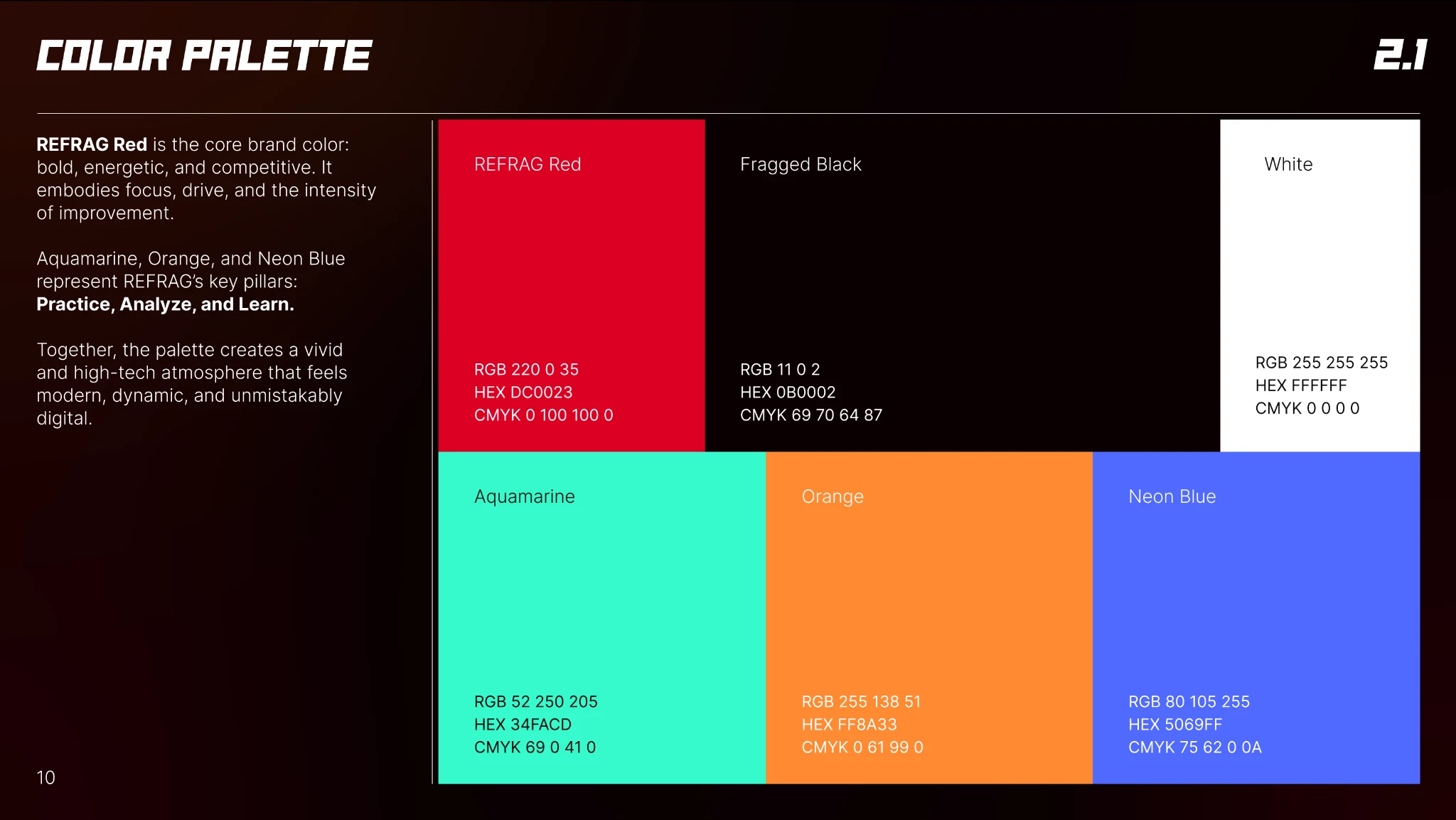
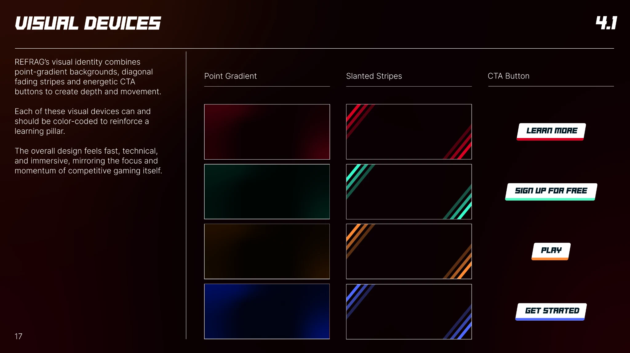
Use those three pillars to organise the colour system and visual cues.
My part
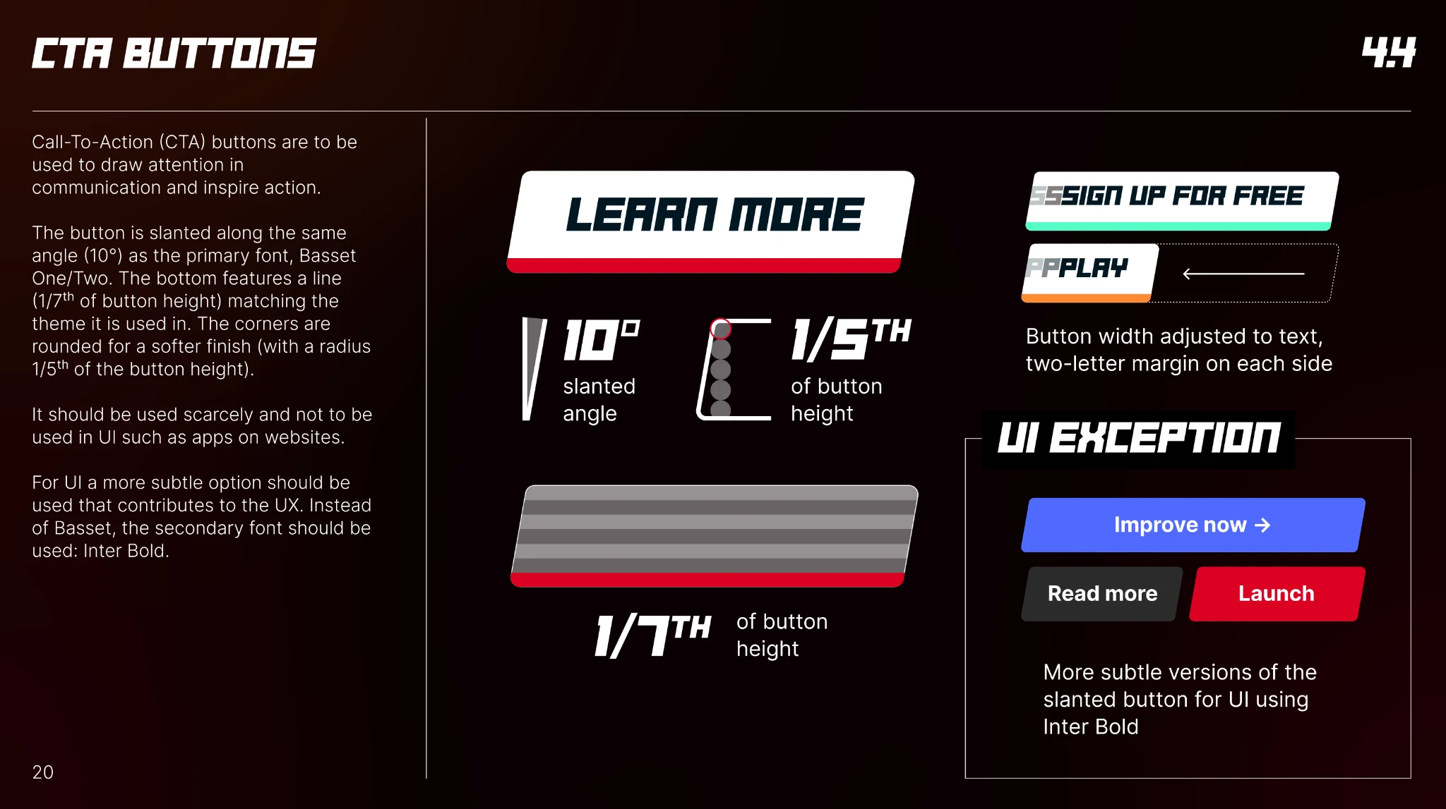
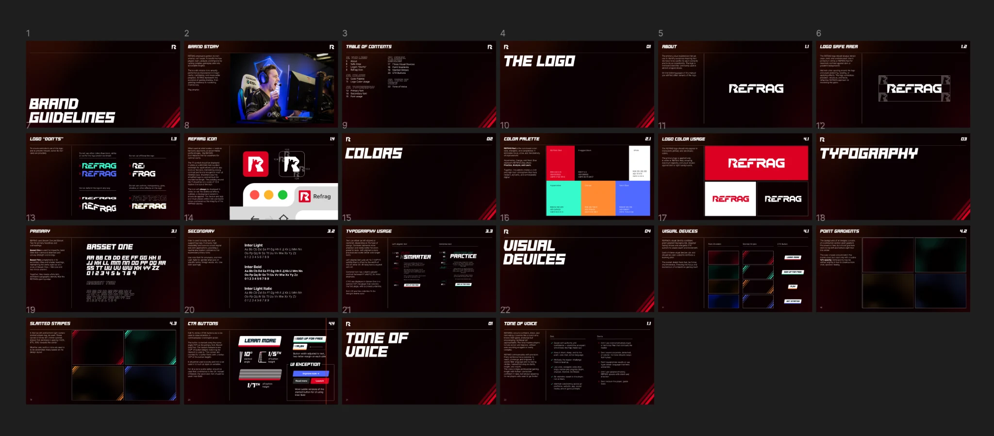
I designed the identity and delivered Figma and Adobe templates, responsive buttons and reusable gradient assets.
What followed
The team can use the templates to build new interfaces and communications while keeping the three product pillars consistent.
REFRAG wanted to keep its logo while replacing the surrounding visual identity. I used the platform’s three main pillars as the starting point.
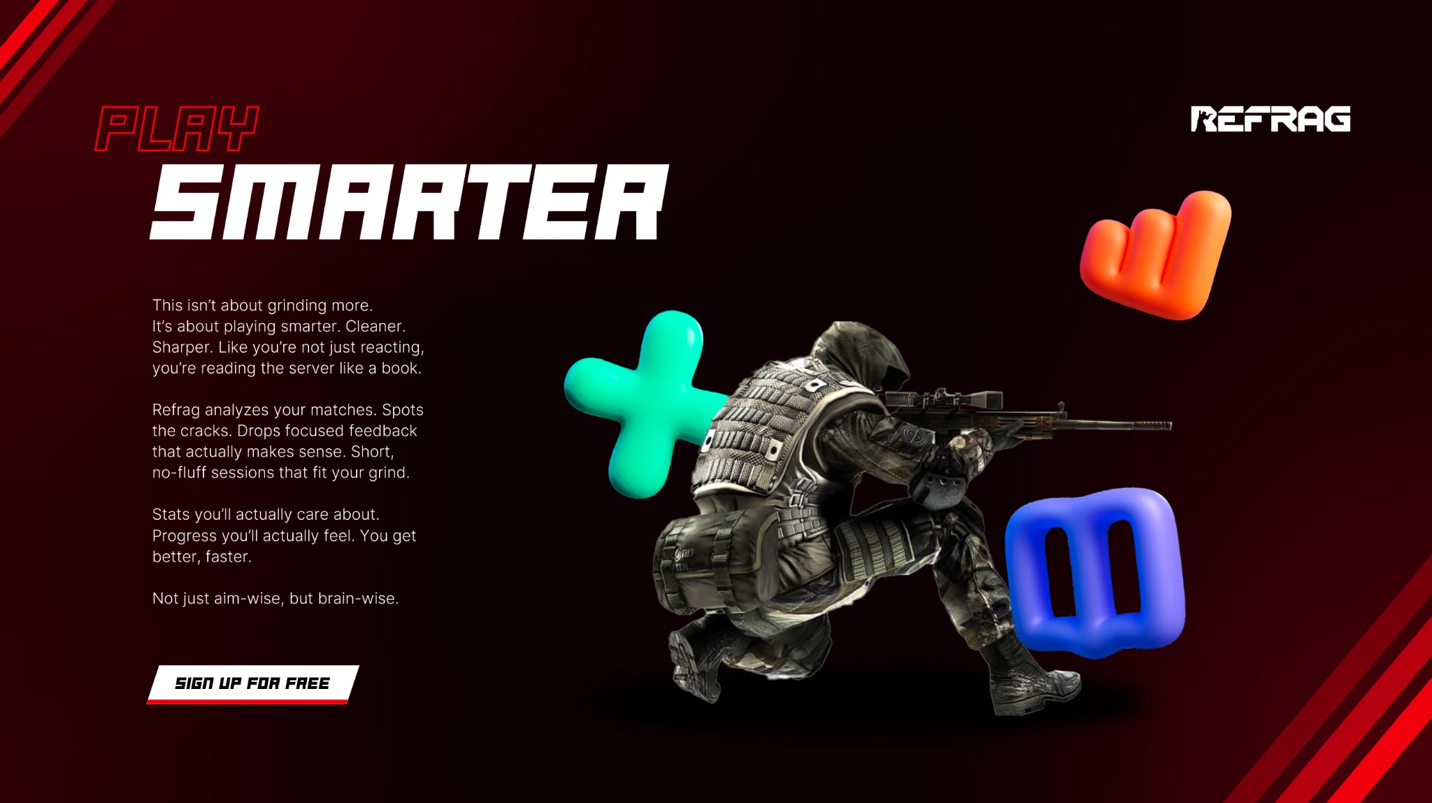
Using colors and other visual cues, I built an identity around REFRAG’s three core pillars: Analyze, Practice and Play.
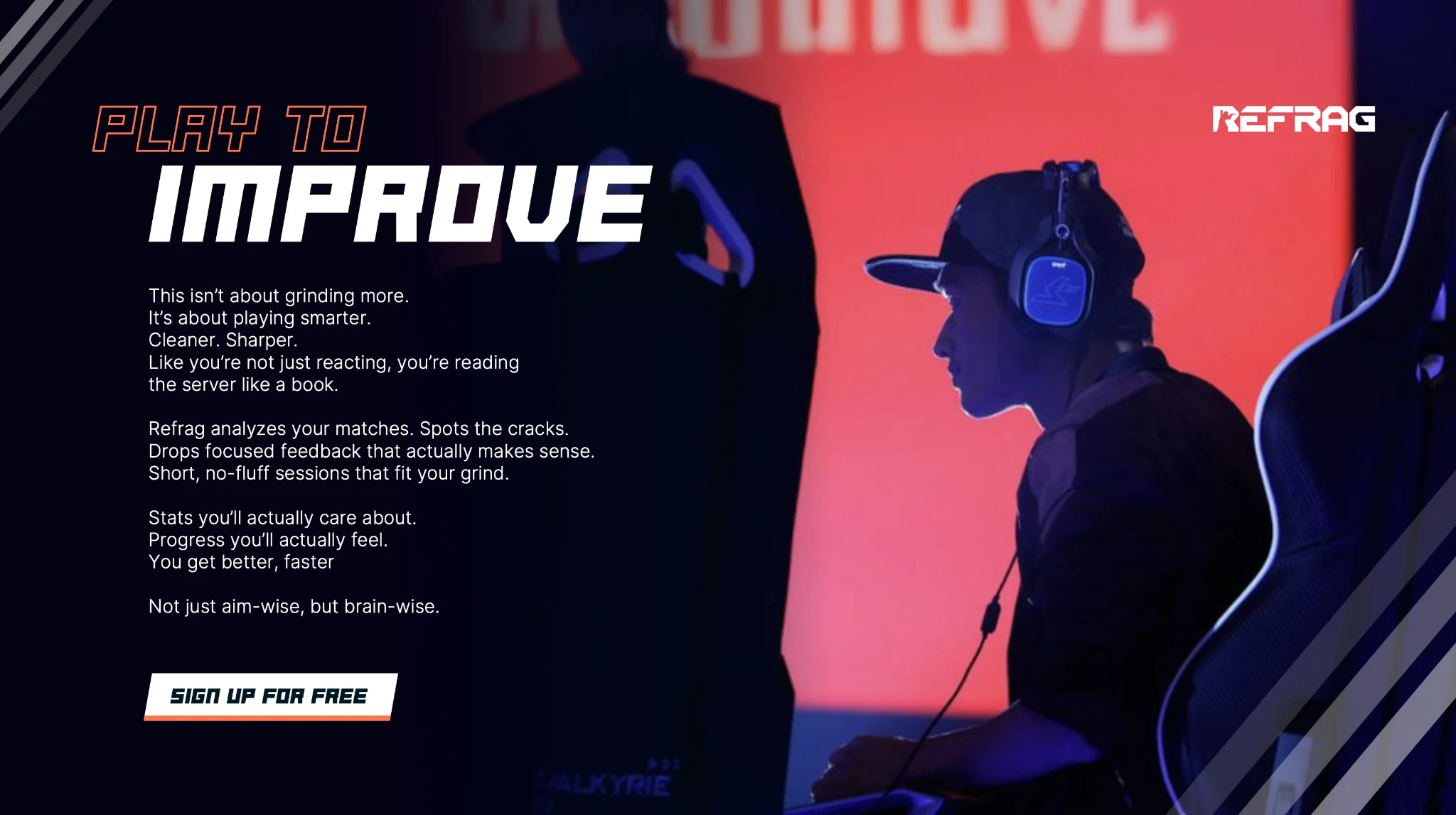
I delivered Figma and Adobe templates for responsive buttons, gradients and other brand assets. The team can use them to create new interfaces and communications while keeping Analyze, Practice and Play visually consistent.