
Caiman Coffee
A premium coffee brand with a rough mascot, tactile packs and a warmer take on the usual specialty coffee codes.
The brief
Explore a more characterful premium coffee identity as a personal concept.
What mattered
Specialty coffee often relies on restrained visual codes.
The idea
Use a distinctive mascot and tactile packaging to make quality feel approachable.
My part
I developed the concept, identity, packaging and presentation as one connected brand exercise.
What followed
The result is a finished brand concept; it was not developed into a commercial coffee brand.
Caiman Coffee presented an opportunity to explore a more characterful direction for premium coffee. The aim was to move away from the restrained visual codes that dominate much of the category.
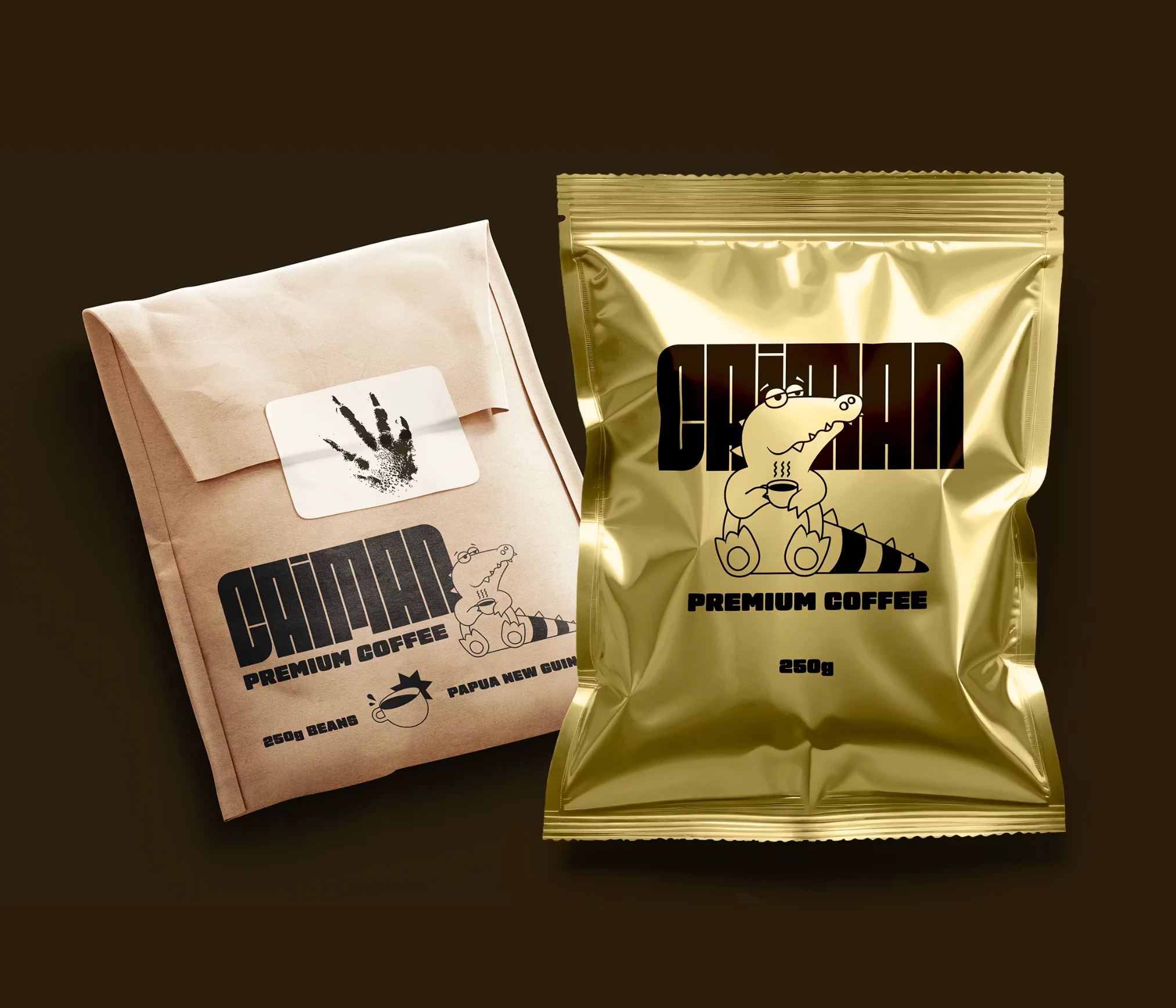
A distinctive mascot, tactile packaging and an approachable visual language gave the concept a recognisable personality. The identity balanced that character with the sense of quality expected from specialty coffee.
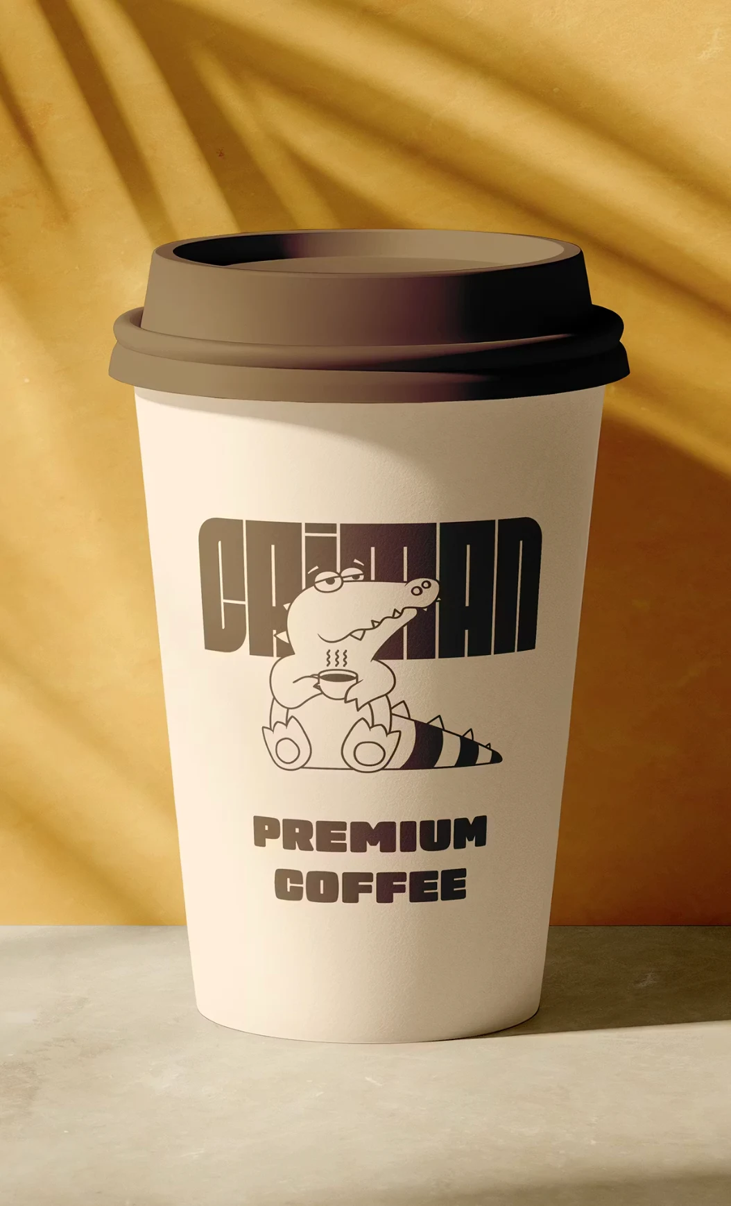
I developed the concept, identity, packaging and presentation as one connected exercise. It was not developed into a commercial coffee brand; this is a personal concept.